Project purpose: Beyond the visuals, I helped craft the overall experience, ensuring that the site resonates with future clients by making support feel accessible and approachable.
Designing with clarity and care
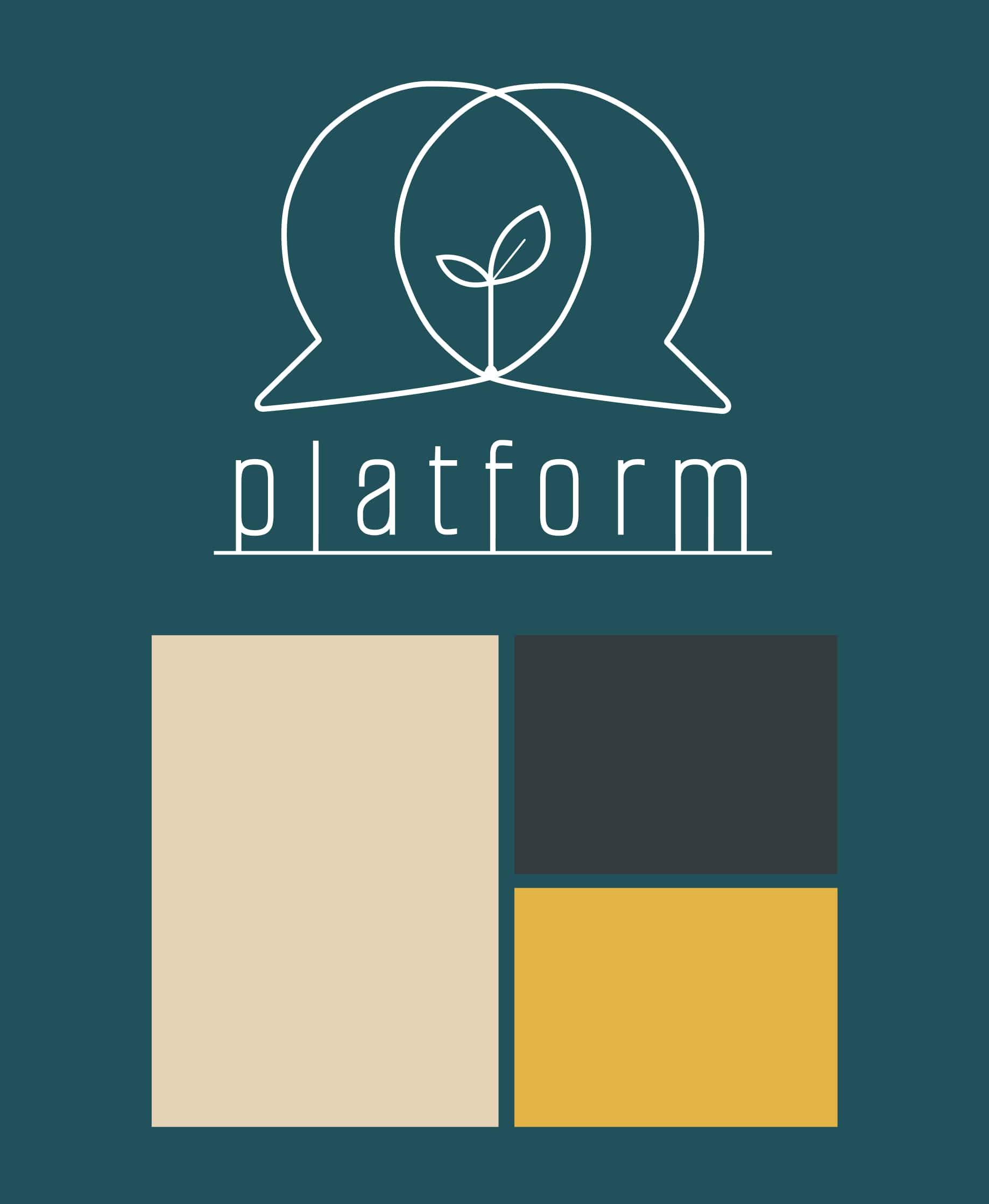
The logo
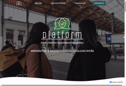
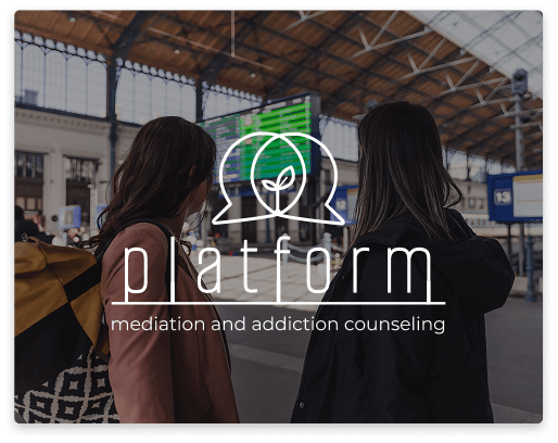
When I joined the project, the name Platform was already in place—a meaningful metaphor for a space where lines and stories intersect. A place to ground yourself, but also one you can depart from. A space for dialogue, connection, and conflict resolution. My role was to help shape the visual identity around this concept, capturing its openness and depth.
To reflect this, I designed a logo with two overlapping speech bubbles, symbolizing dialogue, connection, and multiple perspectives. In their intersection, a small sprouting plant emerges — representing growth, resolution, and new beginnings through conversation.
For the wordmark, I used Alumni Sans Pinstripe, a clean and contemporary font. I subtly modified the letters by grounding some of them to a base line — echoing the idea of a stable platform where people can land, pause, and move forward with clarity.
Visual identity
We chose an urban-inspired color palette to reflect the grounded, real-life context of mediation and addiction services:
Deep blue-gray (#21515B) and charcoal (#333C3F) evoke stability and depth.
Warm beige (#E6D2B5) adds softness and warmth.
A bright yellow accent (#E3B445) brings energy — like a silver lining or a guiding light in complex situations.
To balance structure with warmth, I incorporated curved lines and wave-like elements throughout the site. These subtle flows represent the non-linear, gentle nature of personal and interpersonal growth — offering a visual counterpoint to the platform's more grounded, structured themes.
Designing with sensitivity
The two practitioners had different comfort levels when it came to visibility and promotion. One of them felt strongly about avoiding anything that felt “too marketing-like,” such as a review section. Instead of pushing standard design patterns, I approached the project with empathy — listening closely and adapting the content strategy to stay aligned with their values.
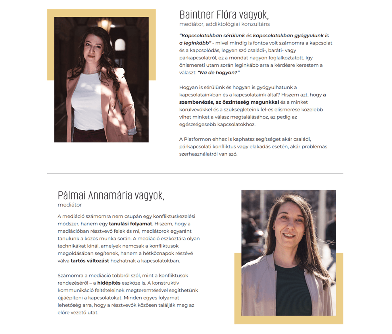
At the same time, I wanted to ensure users felt safe and connected right from the start. That’s why I suggested including portraits and short introductions just below the hero section. This not only built trust but also reflected the supportive, human-centered approach of their practice.
Clarity without overload
One key challenge was figuring out how to provide enough information for potential clients to feel prepared and confident — without overwhelming them. Mediation can take many forms depending on the situation, and this complexity often leads to dense, hard-to-navigate websites.
I aimed for a balance: organizing content in a clear, approachable way, using thoughtful headings, expandable sections, and plain language. The goal was to help visitors quickly understand what kind of support they might need, while keeping the tone warm, calm, and accessible.